Who Pays for Your Healthcare?

A journey through the state of the world’s healthcare spending from 2000 through 2018 through data visualization

Project By:

Aditi Bhatnagar

Qinhao Dong

Suyash Junnarkar

In the past two decades, the world has made tremendous progress on many fronts, including sanitation, nutrition, poverty, and worldwide health.

Poverty levels have declined, mortality rates continue to fall, and overall wellbeing seems to be on the rise. As economies have continued to grow, government health spending and private health spending have also grown around the world.

Through this project, we have analyzed worldwide health expenditure from 2000 through 2018, with the objective of leaving the viewer with a deeper understanding of how time and numerous other factors have transformed our spending on health.

Overview

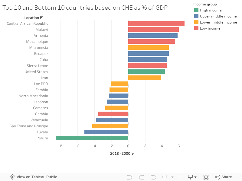
While there has been considerable progress, there is still significant inequality in healthcare spending between low income and high-income categories, with the majority of the burden of health spending being borne by households in the former.

Further, government expenditure by high-income countries seems to be reaching a plateau, with the slack being picked up by private insurance companies, which, once again, disproportionately increases the burden of health spending on households.

On a promising note, as countries move into higher-income categories, the amount of money spent on healthcare also increases. Below, we present some important economic indicators that make up our analysis.

CHE
Current health expenditure

The amount that each country spends on health,
for both individual and collective services.
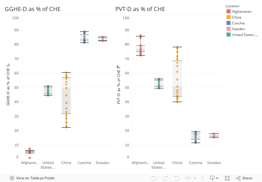
GGHE-D
Domestic General Government Health Expenditure

The share of current
Government resources used to fund health expenditures as a share of the economy.

PVT-D
Domestic Private Health Expenditure

This indicator calculates the  private sector funds that stem from households, corporations and non-profit organizations.
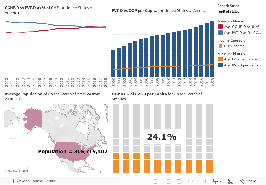
OOP
Out of Pocket Expenditure

This indicator estimates how much are households in each country spending on health directly out of pocket.

How are the terms linked?

The State of Healthcare Spending in the World

The map below shows the net change in current health expenditure (CHE) as percentage of the gross domestic product (GDP) of a country.  

CHE as percentage of GDP provides an indication of the level of resources allocated to health relative to other uses. In other words, it indicates how much a country prioritizes health spending as measured in monetary terms.

Taking a closer look at current health spending from 2000 through 2018, it’s evident that healthcare spending has increased in most of the countries worldwide, with a few exceptions from Asian and African countries.  

To better understand current health expenditure and underlying trends, let’s look at the countries that have seen the most drastic changes in the last two decades.

One of the bigger countries that has seen an increase in health spending is the United States of America, with a 4.35% net increase from 2000 to 2018. On the other hand, Venezuela, due to its financial, political, and human rights crisis, has seen a 3.77% net decrease.  

An important caveat to the description above is that greater current health expenditure may not point towards more progressive and secure healthcare policies.

Current health expenditure is made of two major parts:
Domestic general government health expenditure (GGHE-D) and Domestic private health expenditure (PVT-D). While domestic general government health expenditure indicates the amount of money that the government spends from its own domestic resources on healthcare, private health expenditure includes the amount of money paid towards healthcare by private entities like insurance companies and households.

Let’s unpack some important trends in government health expenditure now.

The visualization above presents domestic general government spending as a percentage of current health expenditure for each country, organized by income categories.

It appears that income might affect the amount of money a country’s government can allocate towards healthcare. There are some interesting trends noticeable over time.

For instance, China has increasingly allocated its available funds towards healthcare. In 2000, about 22% of their total health expenditure was coming from the government, and that number at the end of 2018 was almost 57%.

On the other extreme end, only 0.89% of Afghanistan’s health spending was coming from the government in 2002, and this number only changed to a meagre 5.5% in a span of 13 years.

Having understood a little bit more about how governments around the world allocate money towards healthcare, let’s see how they fare in proportion to private health expenditure.

Above is a line chart representing the proportions of Government and Private spending on health from 2000 to 2018 organized by income categories.

A fascinating trend emerges here for low-income countries in 2000, there is a significant gap between the amount of money that is spent by the government and the amount of money spent by private entities like insurance companies and households. By 2018, this gap had not undergone any change on average.

Looking at lower-middle income countries, the gap between government and private spending was still considerable in 2000 but this gap almost closed by 2018.

For upper-middle income countries, the government was bearing a majority of the health expenditure in 2000 and this gap increased substantially by 2018.

Finally, in high-income countries, the government spent a large share of the health expenditure in 2000 and this gap was sustained through 2018.

The conclusion from this visualization is clear; as income increases, the government allocates more money to health expenditures and takes the burden off of private entities and households.

A few case studies

Now that we’ve explored the data at a high level, let’s look at some specific cases to understand country-specific scenarios. The five countries that we’ll be exploring further are Sweden, Czechia, China, Afghanistan, and the United States of America.

In the radial chart above, we present the amount of money spent on healthcare by the government and private entities.  

Afghanistan, which has suffered from political and financial instability for many decades relies on its private entities and households for a huge majority of healthcare spending, while the government contributes but a small fraction towards health expenditure.

Sweden adopted universal healthcare in 1955, the results of which can be seen in the proportion of the money spent by the government. On average, Sweden’s government pays 83% of the health expenditure, with only about 16.6% of the burden falling on households and insurance companies.

Czechia’s trends are also similar to Sweden, presumably because of a small population and its high-income status.

United States is peculiar in the sense that while its government pays for a large chunk of the country’s health expenditure, about the same percentage of the health expenditure also comes from private sources.

China shows the same trend, presumably due to a large population and stark economic disparity.

The box-plot below considers the variation of change these countries have undergone in terms of government and private expenditure over the years.

Looking at the box-plot, it is immediately apparent that China has undergone a rapid transformation in the sources of its health spending while most other countries have remained relatively stable across the years.

Explore the financial health status of your country

Now that we’ve explored some salient aspects of healthcare spending, we present the viewer with a dashboard to conduct their own country-wise exploration of health spending data.

Type in the country of your choice and see the dashboard update to show the health status of that country.

The visualization on top left illustrates the proportion of government and private spending of the country from 2000 through 2018.

The visualization on the top right gives shows the trend in out-of-pocket spending as compared to private spending over time.

The visualization on the bottom left a sense of the location and population of the country.

The visualization on the bottom right shows the health expenditure of each citizen as a percentage of private expenditure in the country.